


Client Rushad Ginwala is a restaurateur since 30 years in Ahmedabad who has had two very strong brands in the city-one being Tomato’s and the other Mirch Masala. These restaurants have been popular for the last twenty years in Ahmedabad and have a very strong presence and basically a success story.
He got a space and did not know what to do with it. This was a project where we all were involved in the conception of the restaurant from scratch.


We all were involved in first deciding the kind of food we would like to have in this restaurant with Rushad. Then after going through numerous names and having had many debates- I finally suggested ‘Dhoom Dhaam’ and it was instantly accepted. DHOOM DHAAM– meaning celebration – celebrating modern comfort food – became the theme of the restaurant, which by default led us to the concept of the interiors of the restaurant as modern Indian restaurant.
The restaurant had to be placed next to a Tomato’s and Mirch Masala who already had a strong presence. The challenge for Rushad was to bring a new brand, which had an equally strong presence with interiors and food and branding. The challenge for me was to design a restaurant completely different from them at the same time came an impact like no other.
So I decided to go for a slightly formal, finer dining look. It being modern India food the deco also deemed to be modern with some Indian accents to the place.
I started with a colour pallet first. I wanted a minimalistic look as well as monochromatic look -a neutral feel and so worked on achieving that pallet, using grey and greens and highlighting them with brass and black and white accents.
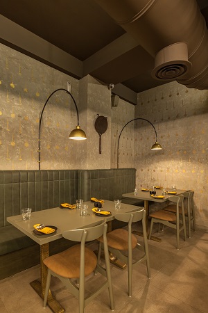

The furniture was designed specially by ‘This and That’ for this restaurant and is now called the ‘Dhoom Dhaam’ collection. The most difficult part with the restaurant was the lights. I spoke to various different people to make instillations. We got a few proposals but none of them seemed right. We struggled and researched and looked for inspiration everywhere and one day I got some inspiration and their came the idea of using ‘Thals’ as a light instillation. After many attempts and samples we got it right and it was just perfect. The light became the centre piece for the restaurant. After that everything fell into place. The wall brackets and hanging lights were also all made on site.
After the ‘Thals’ came into the picture, the logo had the pestle mortar. We knew we had to bring in Indian accents further into the restaurant using these similar elements. It came in various forms of which one form was using a stencil on the walls to finish the walls conceptualised by Sweta Parikh- using some Jaara’s, wooden ladles, a whole collection of old and new pestle mortars in different shapes, sizes, materials, which finished the look of the restaurant.
I brought in Grafico, a branding solution team containing of Ashit and Sweta Parikh- were in Ashit jokingly says he is an extension of me when it comes to design. He was involved with me in some of the visualisation of the interiors, a photographer, a food critic also being part of their contributions along with Sweta doing the actual branding, designing of the menus and so much more.

If you want to share thoughts or feedback then please leave a comment below.


